
WordPress A/B Testing Guide – That Actually Gets You Results
Let me guess.
You’ve tweaked your ads. You’ve fought with SEO. You’ve paid for more visitors, more clicks, more eyeballs.
And the page they actually land on? Pretty much the same as it was two years ago.
Here’s the thing — getting more people to the page is expensive. Getting more of the people already there to say yes is basically free.
This A/B testing guide covers everything you need to run your first test today, without a developer.
Stick with me for five minutes and you’ll leave with one test to run, the exact way to set it up, and a way to know — for real — whether it worked.
“Isn’t A/B testing a whole big project?”
Well, no. Not anymore.
An A/B test just means this: show half your visitors version A, show the other half version B, and let the numbers tell you which one wins.
No opinions.
No “I think the blue button feels nicer.”
Just what actually made more people convert.
It used to take a developer, a duplicate page, and someone to make sense of the numbers afterward. That’s exactly why we built If-So — it handles the whole thing right inside WordPress, splitting your traffic, tracking each version, and showing you which one won. No code, no second page.
So setup isn’t the hard part anymore. Deciding what to test is — and that’s the fun part.
Here’s a real one.
A lead-gen page had its “fill out the form” button below the fold — you had to scroll to see it. Turned out 67% of visitors never saw it. So they added a second button up top. That was the entire change.
Result: an 87% lift in conversion rate.
One button. Eighty-seven percent. That’s the kind of thing sitting on your site right now, waiting.
First — decide what a “win” is
Before you test anything, get clear on what you’re counting. That’s your conversion — the action you want more of. A purchase. A form submitted. A “call now” tapped.
And you don’t have to pick just one. On the contrary — track as many as you want. In If-So, each conversion is simply the page they land on when it happens: the pricing page, the form, the thank-you page.
That matters more than it sounds. If not many people actually buy (small traffic, or a big-ticket product), a “purchases” number on its own can take months to say anything real.
So track the steps before the sale too — how many reached the pricing page, how many made it to the form.
Those pile up far faster than sales do. So you get a real signal in days, instead of squinting at three purchases for a whole quarter.
Watch them all, side by side, and let the numbers tell you what’s working.
So what should you start checking?
Almost anything on a page can be checked — but don’t overthink it. The biggest wins usually hide in the smallest things, and they sit closest to the “yes”: your call-to-action button, the words right around it, your headline, your form.
Little changes, big swings. Start near the button people are supposed to click. That’s where the money is.
I’ve put a menu of ready-to-run tests at the bottom of this post — each one general enough to work on any site, and each with its own step-by-step page.
Running it is super simple
You don’t need a developer, and you don’t need to build a second page.
To keep this A/B Testing Guide practical, let’s use a headline test to walk through the setup. Version A is your page exactly as it is. Version B is the same page with one thing changed: the headline. You type the new version straight into If-So. No CSS, no code, nothing to rebuild.
That’s the whole trick: one variation, one change, and now you’re testing.
If-So splits your visitors 50/50 and keeps it consistent — a returning visitor always sees the same version, so your data stays clean.
Then you tell it what counts as a win — usually your thank-you page. From there it tracks views, conversions, and conversion rate for each version, side by side.
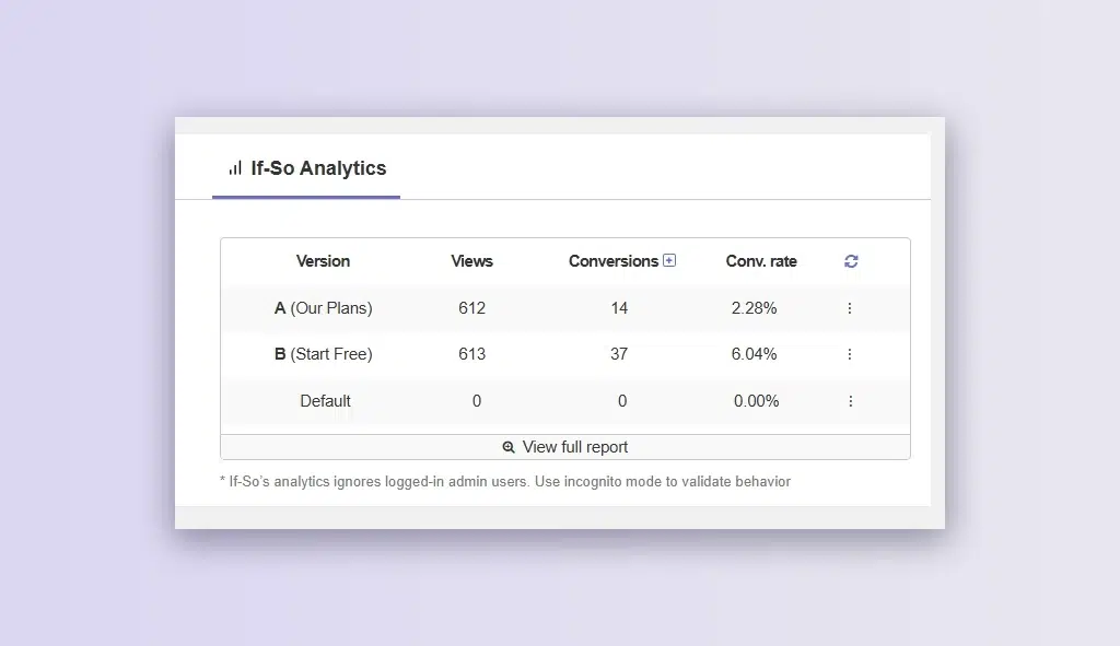
When enough people have gone through, it checks whether the gap is real (statistically significant) and flags the winner for you (Sample size calculator)
No code. No spreadsheet. No guessing. That’s it.
One rule so you don’t fool yourself
Test one thing at a time.
If you change the headline AND the button AND the form in the same test, and it wins — you’ll never know which change did it. So: one variable. Let it run until you have real numbers (not 12 clicks). Keep the winner. Move to the next test.
That’s the whole loop. And it compounds — every test you keep makes the next one start from a higher floor.
Your first win is one test away (A/B Testing Guide)
Pick one. Start today. Each one links to a short A/B Testing guide with the exact setup steps:
- Change your CTA button color → — the simplest test there is. One line of CSS, nothing rebuilt.
- Move your CTA above the fold → — add a second button up top so nobody has to scroll. This is the 87% story.
- Change your button text → — swap “Submit” for something that says what they get.
- Rewrite your headline → — benefit vs. feature; see which one holds them.
- Shorten your form → — drop a field or two and watch more people finish.
- Add social proof by the button → — a testimonial, logos, or a rating right where they decide.
All of it runs inside WordPress with If-So — the split, the tracking, the winner — no code, free to start. Pick the one that made you nod, and go.
Come back next week and tell me what won.